← All projectsUniversity team project · 2025

Collaboration Network Visualization

An interactive desktop application for exploring scientific co-authorship networks — from the global graph to one selected researcher.

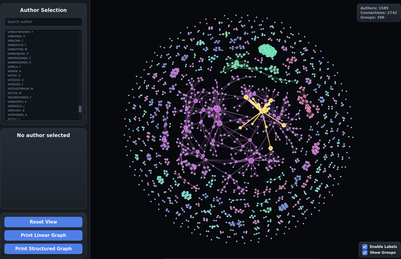
Final collaboration network visualization overview
Final overview of the interactive network: authors, connections and connected groups stay visible in one navigable view.
~2,500authors in source graph
1,589authors in final view
396connected groups
Pythondesktop application
// the challenge

Make a dense scientific network readable.

The source data contains many disconnected components, dense local clusters and weighted edges, but no spatial coordinates. The task was to turn that abstract graph into a desktop tool where a user can understand the whole structure and still find one author without losing context.

The result is a Python application built around a custom force-directed layout. It combines graph analysis with manual rendering in PySide6, so the visual language can respond to zoom, selection and search instead of behaving like a static chart.

  • Parsed and modeled an undirected, weighted author graph
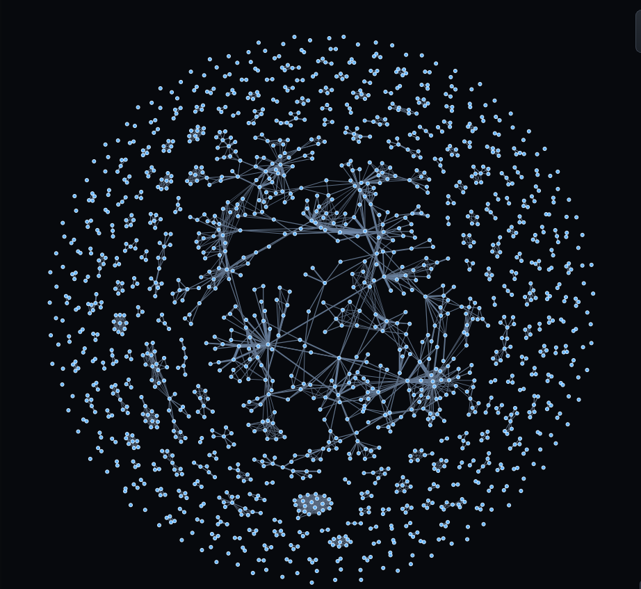
  • Implemented iterative force-directed layout with cooling and local repulsion
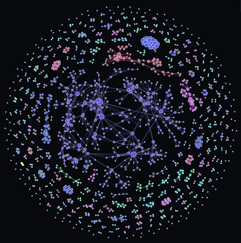
  • Mapped degree, collaboration intensity and connected components to visual attributes
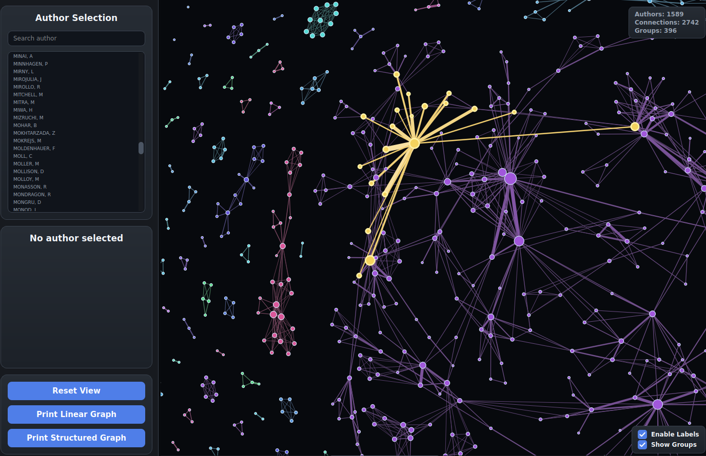
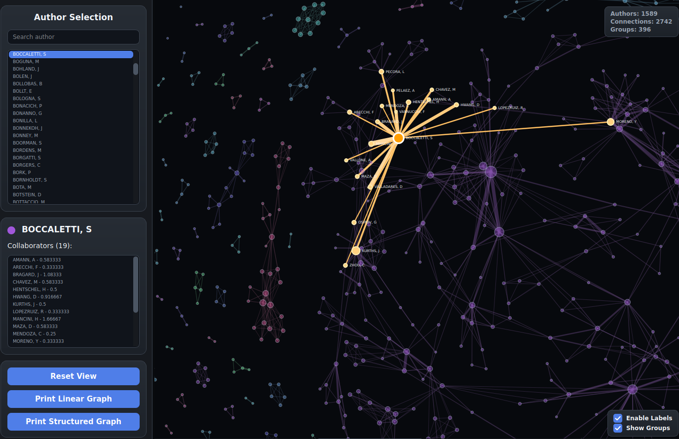
  • Built hover, selection, search, zoom and focused-detail interactions
  • Collaborated on a shared Python desktop application
// implementation

From GML data to an explorable graph

01

Graph input

GML describes an undirected graph. Node labels identify authors; edge values store collaboration frequency.

02

Force layout

An iterative Fruchterman–Reingold-inspired solver balances node repulsion and edge attraction from random initial positions.

03

Stabilisation

Cooling, force normalisation and local repulsion keep small components compact while the global layout settles.

04

Visual mapping

Node degree controls size, collaboration intensity controls edge width and connected components receive distinct colours.

05

Interaction

Hover, click, search, zoom and selective labels provide detail on demand without covering the global structure.

// layout experiments

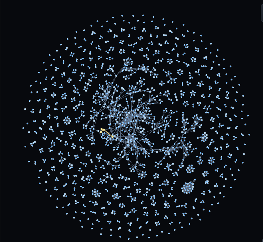
The layout is not just a one-shot force simulation. Post-processing compresses distant components and local repulsion improves the shape of small groups, making the graph easier to scan.

Basic force-directed network layout
Initial force-directed layout with the graph structure exposed.
Fish-eye post-processed network layout
Fish-eye-like post-processing reduces empty space between distant components.
Network with node size, colour and edge width mapped to graph attributes
Graph attributes become visual signals: degree changes node size, groups change colour and edge value changes stroke width.
Highlighted author and direct collaborators on hover
Hover keeps one author and its direct collaborators in focus.
Selected author with highlighted collaborators and details panel
Search and selection focus the view while preserving the surrounding context.
// final result

One graph, three useful scales.

The final application supports both an overview of the dataset and targeted investigation of a single researcher.

01

Global structure

Show all components, identify dense regions and compare the relative importance of authors without reading every label.

02

Focus + context

Selecting an author highlights the direct collaboration neighbourhood while the rest of the graph stays visible as context.

03

Detail on demand

Search, zoom and selective labels reveal names and author details only when the user is ready to inspect them.

// outcome

A functional interactive visualisation of a scientific collaboration network — combining graph algorithms, a custom rendering layer and an interface designed around exploration.

Interested in data-rich interfaces?

Let's make complex systems easier to explore.

Work with me →